Saturday, December 10, 2011

FINAL ENDING!!! :)

As much as I have enjoyed painting and experimenting with gouache and watercolor, I am happy to finally be finished with Illustration. I did enjoy this class and it actually opened up a now career opportunity to me.  And who knew I would actually enjoy to use watercolor!!! I never thought the day would come. With that being said I am not going to post my four choices of art for this final!

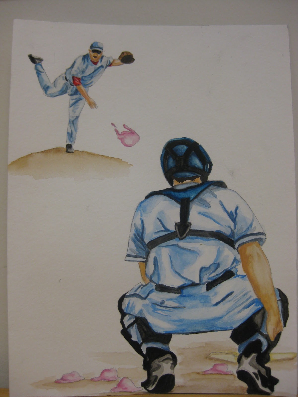
For starters here is my Society of Illustrators piece. I enjoyed doing this piece a lot, because of the use of vibrant colors and the subject matter was something I enjoyed painting. I liked that there was a strong light source across the subjects face so I was able to play with shades and highlights a lot. The most challenging part of this painting was the background. It was difficult to make the background visually interesting, but without taking the perspective off of the main view point. This piece was one of my favorites to do all year, considering the size of it wasn't the funnest.


Next I have my book cover of "The Adventures of Huckleberry Finn." I won't lie, I was dreading this project, because I'm not good with coming up with a new idea for a book that has been republished 100x and not making it look cliche. Of course it turned out cliche with the use of using Huck on the cover, but I wanted to use two forms of Huck's character to remind the reader of the life Huck was running away from. I did this, because when people think of Huckleberry Finn they just thing of him on a raft with a runaway slave and completely forget why he was running in the first place. It was difficult to illustrate the two Hucks, because they obviously had to look like the same person, which is a struggle for me. The background was also a HUGE struggle. I ended up going home and slopping water onto paper and painting blue and green streaks, and lucky for me when it dried it turned looking like a cloud in the sky with ground and maybe a river by the levy. As much as I was hating this project it turned out better than I had thought and I ended up liking it. But I wouldn't be heartbroken if I wasn't able to do it again. :)


My third piece is my Abraham Lincoln piece. This painting started off as a struggle, because I chose to use gouache and I had not played with it enough to know exactly what I was doing. The coloring in Lincoln's face and jacket did not turn out how I had thought, but when the colors blended together I actually liked the outcome. I wish the yellow in the hat had turned out darker, but I still like the way the hat turned out. And like everything else the background kicked my butt!!! I was nervous to lay down the background after I had already finished Lincoln, because I didn't want it to be ruined. I know that you're supposed to focus on the background first, buut I wasn't even sure how the main subject was going to turn out. I wish I would have expanded the background a little more and dropped a little more color into it, but for being an experimental painting, I liked the final turnout.


And for my last piece, its the classical music cover. I also hated this project as well, because I have trouble portray old fashioned stylistic objects. I chose to just paint the composer in order for people to know that it was a classical album and then chose dark blue, yellow, and red to give it a romantic/dark mood. The red did not turn out as dark as I had wanted it to in some spots, but I didn't want to over do it and ruin the entire painting, so I left it as is. Surprisingly the hardest part for me on this piece was the coat. I enjoyed doing the face and hair, but to highlight and darken certain areas of the coat was challenging. The paints kept lifting up or not turning out how I had wanted, so I would just darken the areas to help with the blending. Coming up with the background idea was hard, but completing the background wasn't. I wish I had made more structure to the piano, but I attempted to go into PhotoShop and paint in a little more structure than there was. Overall, for as challenging as this project was for me I like how it came together in the end. 

Monday, December 5, 2011

Latest Illustrations


This first illustration is for my world record, "Most ice cream scoops thrown and caught." When I first attempted this painting, I was nervous about how I was going to approach it and how I wanted the style to be. It turned out a lot better than I had anticipated. The other thing I struggled with was enhancing the view on the ice cream scoops and filling in the background with something other than white. I ended up the white background, though, because I figured if I did anything else it would take away from the illustration and that I should leave space for the design. This photo is slightly darker than what it really looks like and I plan to reprint it as some point. 

This piece, unlike the other looks lighter than it really is, but you get the idea. I also struggled with this one, because I wanted to give it a classical look by using darker reds and blues, so accomplishing this was a struggle. It was also difficult to continue the the focus on Bach. Once I completed painting the pianist, I focused to the background, which remained a struggle to me. I ended up just doing a blotchy wash, which I feel turned out nice. I added wording to the right side later on in my print process, but that was just to give the viewer an idea of what could fill that space. 

Monday, November 28, 2011

Is it Christmas Break Yet?

First day back from Thanksgiving break and I still feel like I've been at school the whole time. I can't wait for these next few weeks to finish up! I've been working  a little slow on the past few projects, but I plan on finishing up on the CD album cover and the World Record magazine layout by this week and then knock out the stupid book cover! I did Scarlet Letter last semester so I think this year I will mix it up and go with Mark Twains, Huckleberry Finn....I mean after all I am from the Hannibal area and should maybe represent it a little :P, although I'm not sure if its the greatest place. I've pondered some ideas for the layout, but lets see what happens!

Friday, November 18, 2011

JINS

A quick watercolor I did for my JINS class relating to the Neotropics. Could look worse for doing it in 30mins haha.

Monday, November 14, 2011

Native American Heritage Month

This project was a struggle at not trying to be "cliche," so I just came up with something somewhat similar to what I did in the past class. Not exactly the same, but would maybe fit with the series. Painting the figure black and white was a lot larger of a struggle than I had anticipated. I wish it had been tighter, but I did what I could without over doing it. I also struggle with the layout of the composition of the poster, but here it is anyway.

Wednesday, November 9, 2011

Just Bloggin How I Feel...

I just want to put out there that I HATE all CD projects! This is my 3rd semester in a row of making these damn things and I'm burnt out! Thanks for narrowing the subject choice, but sucks when you can't come up with one damn thing! What's a girl to do?!....HELP!

Thursday, November 3, 2011

SI

So, as much as SI can sometimes suck because of the size, I actually enjoyed this piece, although it took me awhile to finish it! I do like the color in this piece and the subject matter. I'm glad I stuck to a limited palet, because it helped me to create this piece and fix any struggles I came upon!


And for the record I don't want to hear any jokes about me having a "clean palet." It is clean no longer!!!

Thursday, October 27, 2011

heres the other half


So this is the photo that goes with the first comment on my blog "been a minute" haha

been a minute

So yes, it has been awhile since I've posted,  but here I am doing it now!

I'll be honest about this illustration...I hate it. I tried doing something cool with the background but in the process I lost it. Such a fail and poorly executed. Maybe I'll get it the next time :P


Here is my "life" illustration...it is simple, and once again I lost the background...I"m really trying to work on it haha (sorry it's not flipped)

And here is "death"I think the iPod turned out well, but again...the stupid background!...any ideas? Lol HelpWanted!

Tuesday, October 18, 2011

Midterm


LINE DRAWINGS


I chose this piece, because I wanted to show a use of textural line shown in the wood of the arm rest on the chair and the directional line shown on the couch. 


I chose this piece, because like the previous drawing this one shows texture in the frame of the window, and also shows shadowing through directional horizontal lines. 
This is my favorite of the three and I chose it, because I like the contrast of the bolder lines giving the drawing a comic strip appearance. 

WATERCOLOR PAINTINGS


I chose this piece, because I liked the limited palette color use and wanted to show and example of this scale of value with a single color. 

This piece was chosen, because it was a challenge for me to get so many colors ran together without creating a brown. Also it was difficult to get such a dark pigment with watercolor.

WATERCOLOR PAINTINGS WITH LINE


Now although I know you may not be a fan of this piece I liked this one due the the overlapping of the colors and the texture they created. This was an experimental painting for me, but it all turned out good for me. Also, I like that the lines used in it are very simple and are used just as an outline. 

This pieces on the other hand has darker more defined lines, which helped determine the nose and jawline. I also liked this piece, because of the highlights in the face and mouth. 

This picture has a better orange pigment to it, but it poorly perceived in this photo, but I chose it because I liked the reflection of the ball shown on the court, which was a huge challenge for me during the process. There is not tons of line used in the piece, but it is shown to define where the ground ends and around the ball. I then used darker lines to show the lines around the basketball. 

GOUACHE PAINTING

I chose this piece as my gouache painting, because although it was a complete challenge to learn this media I liked how I was able to manage a decent background with this painting. I also like the combination of colors in this piece. There was a challenge with the shading of the skin, but have learned to stay away from skin toned subjects. 

LINE AND COLOR ILLUSTRATION

Okay, considering this is my first time in my art career using a Wacomb, I liked this piece! I would like to hope that I would get better with it, but it's quite a transition to make. I liked this one from all the others, though, because of the texture and the highlight used on her skin. Also, I never use facial expressions like this in my work, so this was a new things as well and i liked how it turned out overall. 

This is not the finest work of line are you've seen on a Wacomb I know, but for me this is a 10. I have long before I master this media, but I chose this piece, because it was one of my better ones. I do like the shoelaces on this shoe, though because it gives it a sketch/cartoon appeal. 


SELF CHOSEN 


This piece is my self chosen piece. I was really nervous when this assignment was assigned, but I like that I was able to create this painting without using a skin tone and mixing different shades and colors together. I wanted to go with an antique feel and the dark yellow helped me to be able to do so. Also, the  background turned out better than anticipated, but I wish the blue and red brought out in it showed more, which it does not do so in this photo. Overall, though for being a gouache painting this turned out much better than I had imaged.  


Thursday, October 6, 2011

hmm

Okay, so I decided that I think this photo brings out the true colors of the Lincoln painting more so I'm uploading this one as well

Ab and Cher

So here is the follow up to my previous post. I am going to add the painting now. I will say that I did try to fix the blocked color on her face and the strokes the brush left behind, but it was an epic fail. The woman in the portrait is supposed to be a younger version of Cher before she did all that crazy work to herself, but I feel as though I lost it when trying to mess with the shading.


Now, as for the Ab painting, the brush strokes worked in my favor. The painting was supposed to be a litte more blue with an antique yellow tint to it, but naturally when you mix blue and yellow it turns slightly green, but then again this accident turned out well too. Sometimes you just get lucky. Now for the background I'm still trying to decide on how I feel about it...does it look like fireworks are going of behind him? Is it too faded? I'm not sure. I may like it. I will mess more with the contrast whenever I get around to printing it for the final 13x19. Until then, here is what I have. 


Wednesday, October 5, 2011

GWash

I will still need to post my recent paintings using gouache, but from what I've done I can already determine I'd rather use watercolor than gouache. I love how the pigment for gouache is darker than watercolor, but I struggle getting the colors to apply smoothly and blend according to what I have in mind. I also had a problem with  applying the paint and liking the way it looked, but once it dried it showed every stroke I had laid with my brush and I did not like that. So for now this is my view on gouache, but  I will show you what I mean, exactly when I post my pieces. :)

Wednesday, September 28, 2011

Product/20x30 Part 2

So here is my product. Modori, is a lemon liqueur that I decided to choose because of the color. I wanted to challenge myself with using a bright green and also limiting my paint palet to a minimum color use. I feel as though I could have done better, but here was what I turned out with. 


Here is my landscape. I know we were able to stray away from the landscape, but I didn't like how my last one turned out because of the paper, so I figured I would tackle the landscape one more time. This paper had much better quality and I was able to work with the color blending more. I like the way this one turned out even though it is pretty simple. I would like to tackle something more complex and challenging if I were to have to do this again. Not saying I want to right now. I do like the variety of colors used in this piece though.

Monday, September 26, 2011

This is NOT my calling

I am terrible with this!!! I cannot draw on a pad and look somewhere else completely different...I think this is all a lost hope.
The Bud Light Lime was my last one I did and I lost patience so it is awful! Same with the peach. The trees were just to experiment and I tried working with a variation of colors on the lion. The picture of the woman is the only one I like, but it was my first one, so I took my time on it, hehe.


Wednesday, September 21, 2011

4 is the new 5, right?

So, I needed to update my blog, so I am adding my portrait from memory, landscape, and 4/5 self portraits.
I HATE the memory portrait with the passion! It's supposed to be my roommate, but as expected it looks nothing like her.
My landscape was done on super crummy paper, ergo I got the turn out of a really crummy painting. It literally got crummy and started shedding paper. Cheap isn't always good in art...usually never good.

As for my self portraits, I have the HARDEST time drawing/painting whatever myself! I never turn out like myself. I always feel like I want to avoid my flaws and try making myself prettier, but it always turns out being a stranger on the page rather than myself haha. But I have four and ran out of time to do the 5th, but she'll be coming (that is which ever stranger I manage to make at that time).

P.S. Sorry some aren't turned properly.


Monday, September 19, 2011

Update

I still have others to add, but haven't finished them yet, and don't want to post them until they are completely finished. But for now here are the ones I've had done. The flowers could have used a little more work, but I figured I'd post them and not mess with them, because I feared I would have messed them up!


Monday, September 12, 2011

Pure Poo


One of these days I will accomplish painting watercolors. I can't wait tillthat day comes, so that my paintings don't look like the ones above anymore. Hehe.